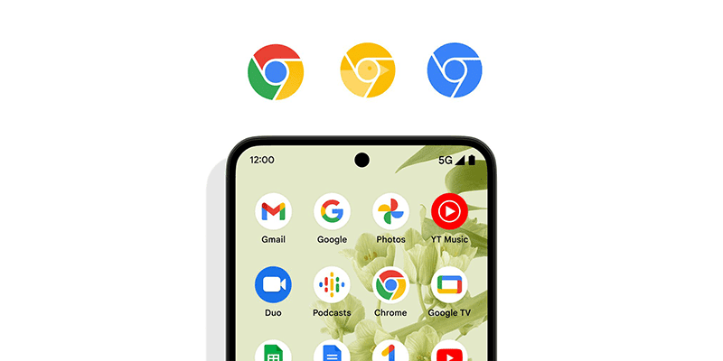
Google Chrome gets updated, simplified icon after 8 years!


 |
| Google Chrome's new look for 2022! |
Check out the new Google Chrome logo!
 |
| Other design considerations |


 |
| Google Chrome's new look for 2022! |
 |
| Other design considerations |
The newly announced OPPO Find X9 Series is undeniably among the best phones in the world today in overall specs, cameras, and features. File...

All content provided on this "GIZGUIDE" blog is for informational purposes only. The owner of this blog makes no representations as to the accuracy or completeness of any information on this site or found by following any link on this site.
The owner of www.gizguide.com will not be liable for any errors or omissions in this information nor for the availability of this information. The owner will not be liable for any losses, injuries, or damages from the display or use of this information.
This terms and conditions is subject to change at anytime with or without notice.
GIZGUIDE is one of the Philippines' leading and most trusted technology-focused websites, delivering the latest news, gadget reviews, tutorials, and much more.
Our team is committed to equipping Filipinos with knowledge about the latest in technology—from trending innovations to practical gadget recommendations that suit every budget and lifestyle.
We take pride in crafting honest product reviews based on our personal experiences, not just specs on paper. From smartphones and laptops to smart appliances and accessories, we test them in everyday settings—commutes, work-from-home setups, coffee shops, and more.
Our goal is straightforward: to help you make informed tech choices that truly meet your needs.
Website: www.gizguide.com

www.gizguide.com | Your Gadget Coach | Copyright © 2025 | All Rights Reserved

Post a Comment